One of the my most popular blog posts stems from a presentation I provided at a local VMUG over 3 years ago. During my presentation, inspired by Kendrick Coleman, I talked about everyday low cost & free tools that help in administering a VMware environment, and one of my favorites is RVTools. In fact when paired with Microsoft Excel Pivot Tables, RVTools is extremely powerful.
Fast forward a little bit, and as visualization tools have become more accessible and easy to use, I would like to share with you another way that you can utilize RVTools to help visualize your VMware environment. One such visualization product that I was recently introduced to is Tibco Spotfire Desktop. Spotfire is not a free tool, although they do offer a 30-day trial which I am using for this post. Spotfire at it's most basic level, allows you to import an Excel spreadsheet, CSV, and a variety of other data inputs and visualize them in a number of different ways.
I definitely subscribe to a 'picture is worth 1000 words' so naturally I wanted to see how I could use an export of RVTools to create meaningful Spotfire visuals. I started small, building on my previous RVTools & Pivot Tables post where we categorized our VMs by O/S, Avg. CPU & Avg. Memory Size. This is a quick recap of what that looked like in tabular form:
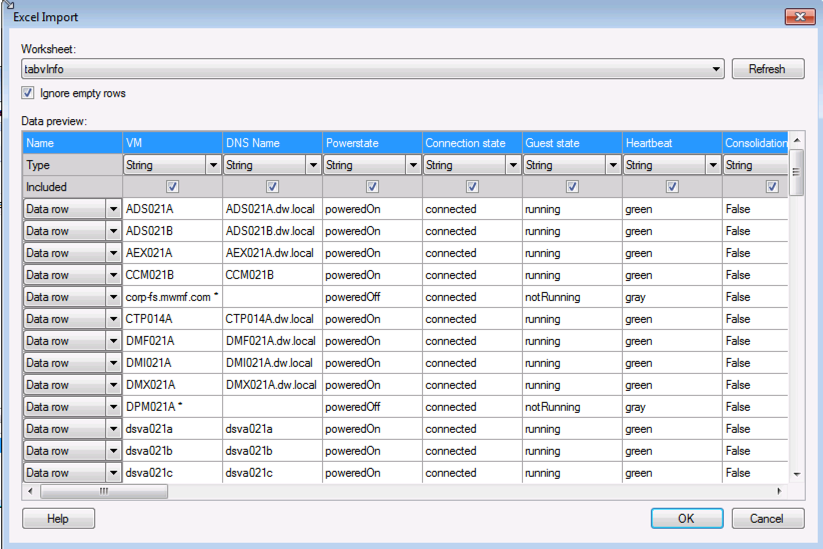
The first thing to do is to install Spotfire, which is straight forward, although support is currently limited to only Microsoft operating systems - no love for my Mac. Once installed it is very simple to open a source file that will provide the data for the visualizations. In my case I am opening the Excel file that was exported by RVTools and used to create my pivot tables.
I am then prompted to select the Worksheet that we will build from and I selected the tabvinfo Worksheet as it is an excellent source of VM data.
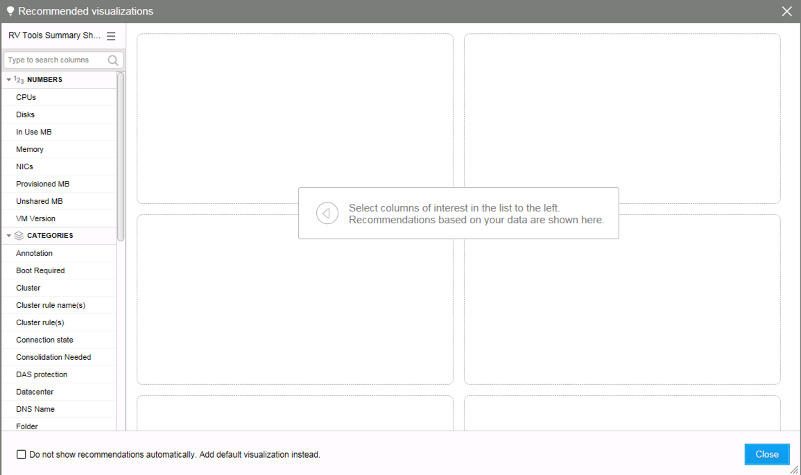
What I really like about Tibco Spotfire is that once the data file is imported, the Recommended Visualization screen appears to help assist with different ways to visualize the data. Scatter Plots, Graphs, Pie Charts - take your pick. I love how you can select different data categories and rows and the recommended visuals change dynamically.
Below I picked OS as my building block, and you can see the various visuals instantly provided. These can then be added to your working dashboard/project using the Add this button.
After adding as many visuals as you wold like, it is very straight forward to duplicate, copy or edit any visual. I changed the Tree Size view to show Avg. CPU and then duplicated it to show Avg. Memory.
I outlined my dashboard in a quadrant view to easily showcase the breakdown of VMs by OS, Avg. CPU, Avg. Memory, and power state - On/Off. Very powerful and easy way to consume the data - which as you hover over any visual (box, pie slice or bar) will also highlight the equivalent piece of relevant data in the other quadrants.
So I can see below that Windows Server 2008 R2 64-bit accounts for 33.9% of my VMs, the majority of which are powered on, accounting for fourth largest average number of CPUs, and fifth largest average memory footprint.
I really like the simplicity of the product and plan on building some more visuals, perhaps by examining some further RVTools output.


